
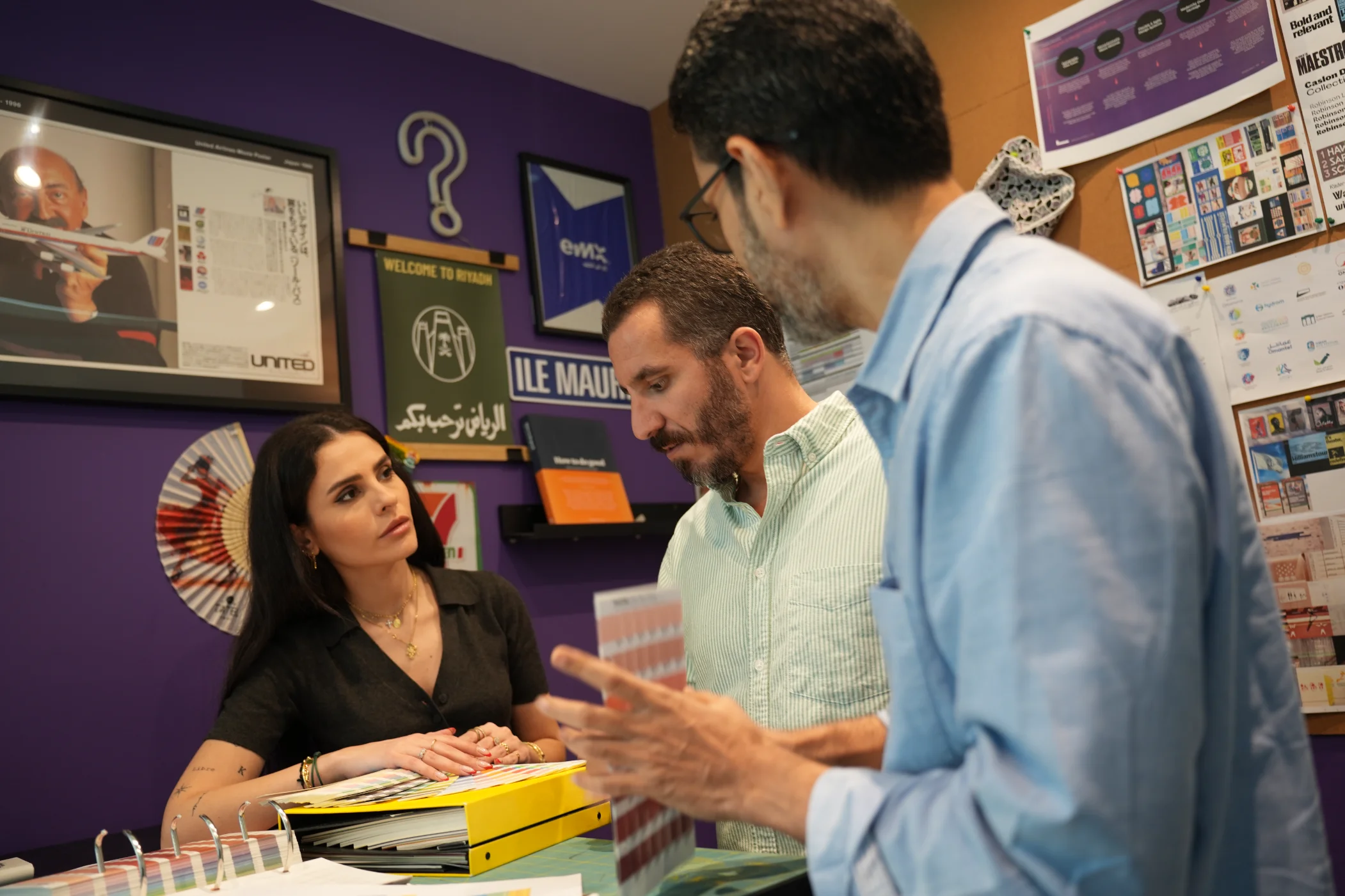
Work That Matters
We collaborate with a diverse mix of sectors, supporting teams from emerging startups to well-established names.
Thank you! Your submission has been received!
Oops! Something went wrong while submitting the form.
.webp)
.webp)


No matching results for your filters.
.webp)
.webp)
.webp)


.webp)
.webp)
.webp)


.webp)
.webp)
.webp)
.webp)
Archive
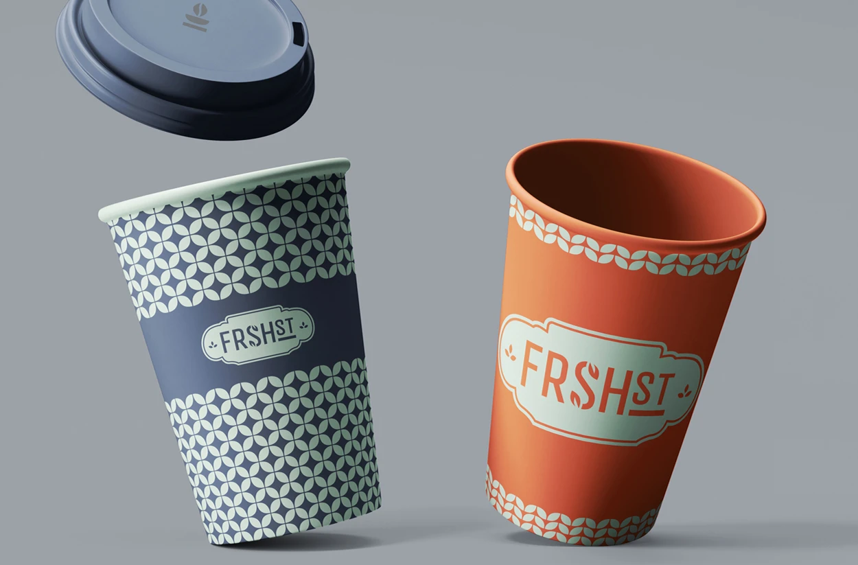
FRSHst
Farm-to-Table, Grab-and-Go, by Fresh Del Monte Produce

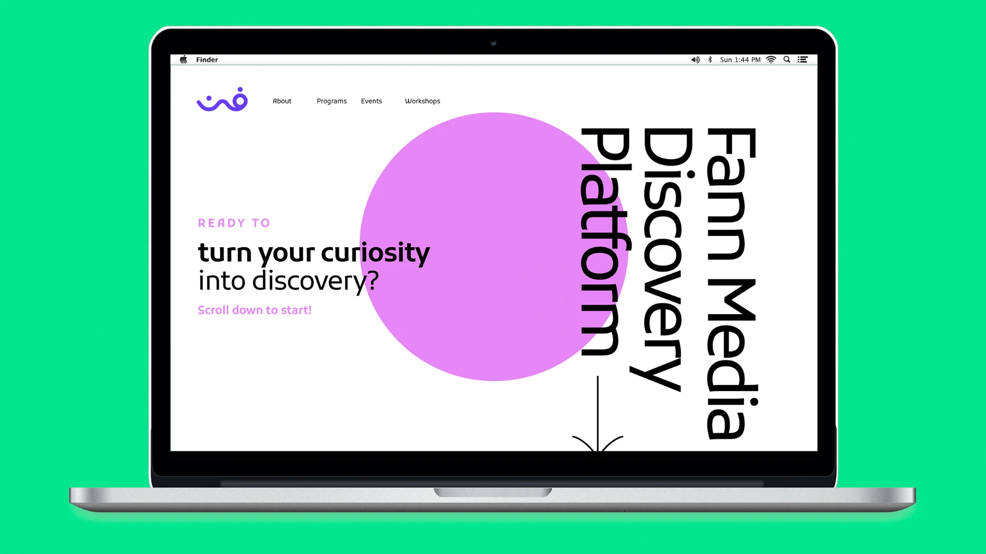
FANN Media Discovery Platform
Sharjah’s Media Discovery Platform for the Youth
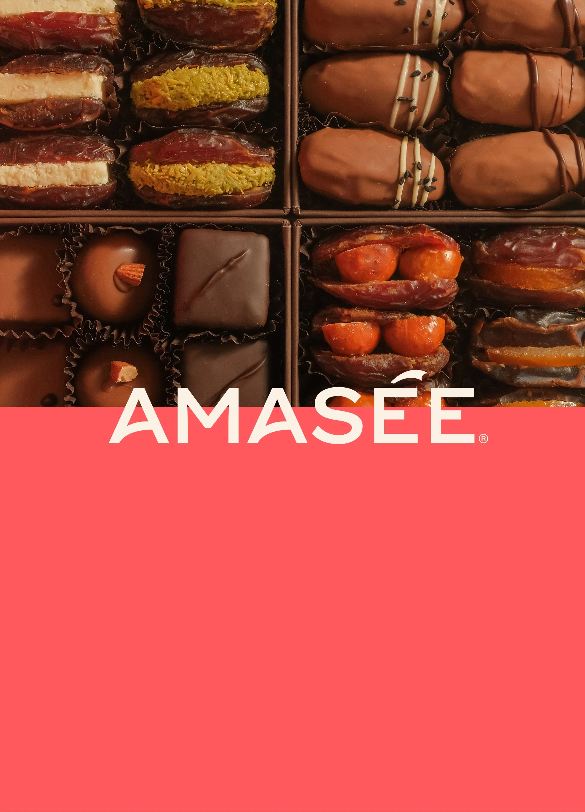
Amasée
Reviving the Art of Taste
Our Practices
Through strategy, design, culture, and innovation, our practices are built to create brands with meaning.
We Build Brands That Matter
We are a global, independent, award-winning strategic brand consultancy helping organizations define meaning and unlock growth.
.webp)