ezgif.com-gif-maker

COCO Logistics

Practices

| |

Services

Brand Messaging | Color Strategy | Creative & Verbal Narratives | Landscape & Competitive Assessment | Logo & Visual Language | Market Segmentation | Naming Strategy | Packaging | Social Content Design | Visual Identity Creation | Web Design & Development

Industry

Industrial

Brief

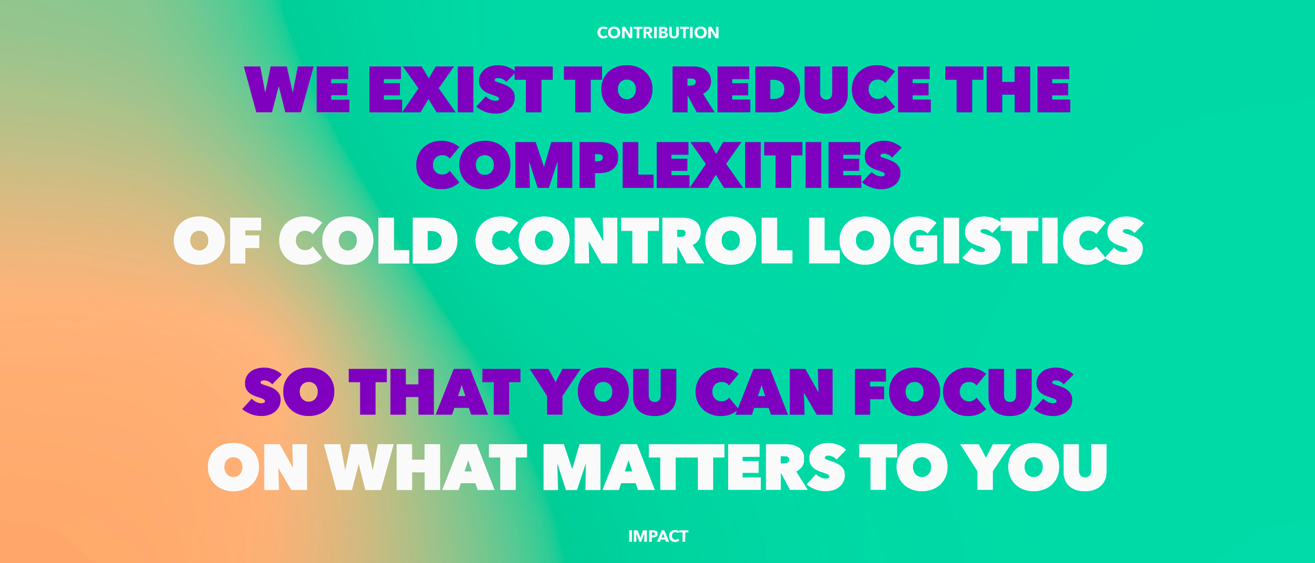
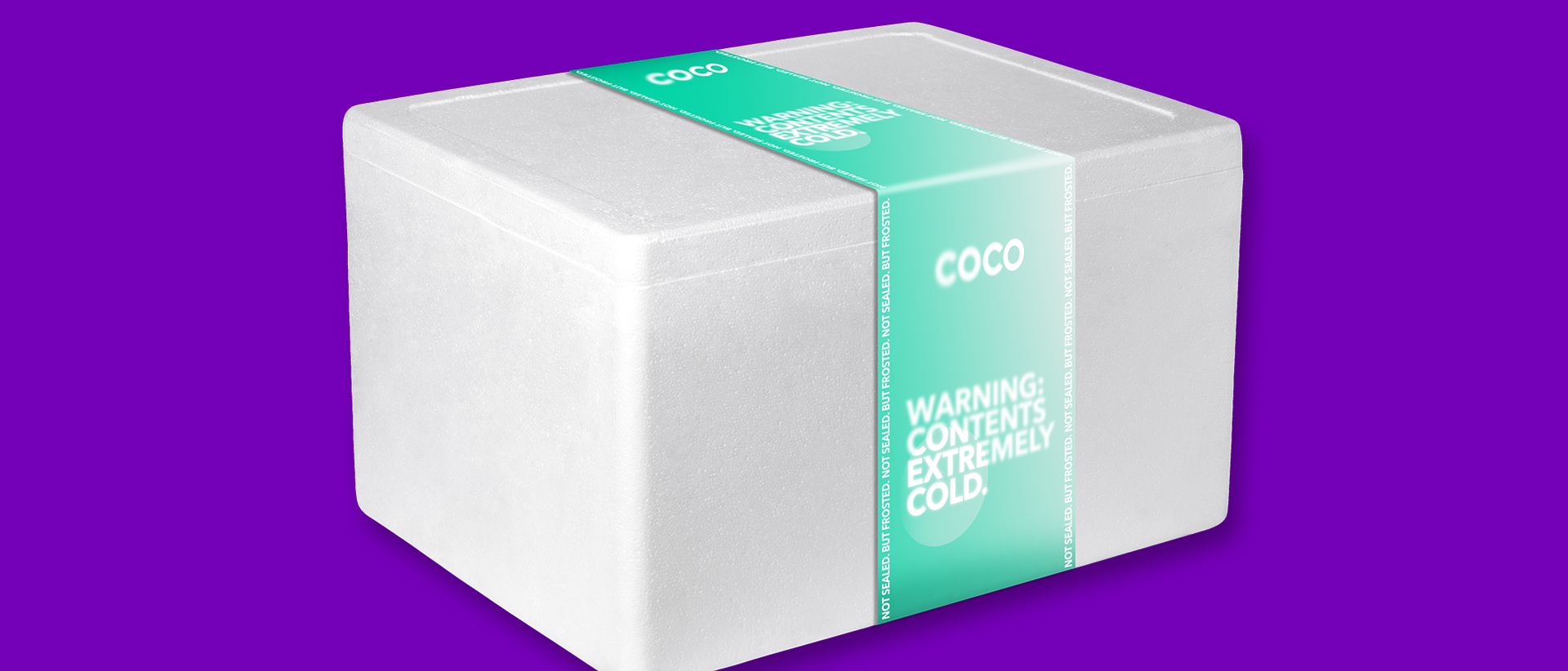
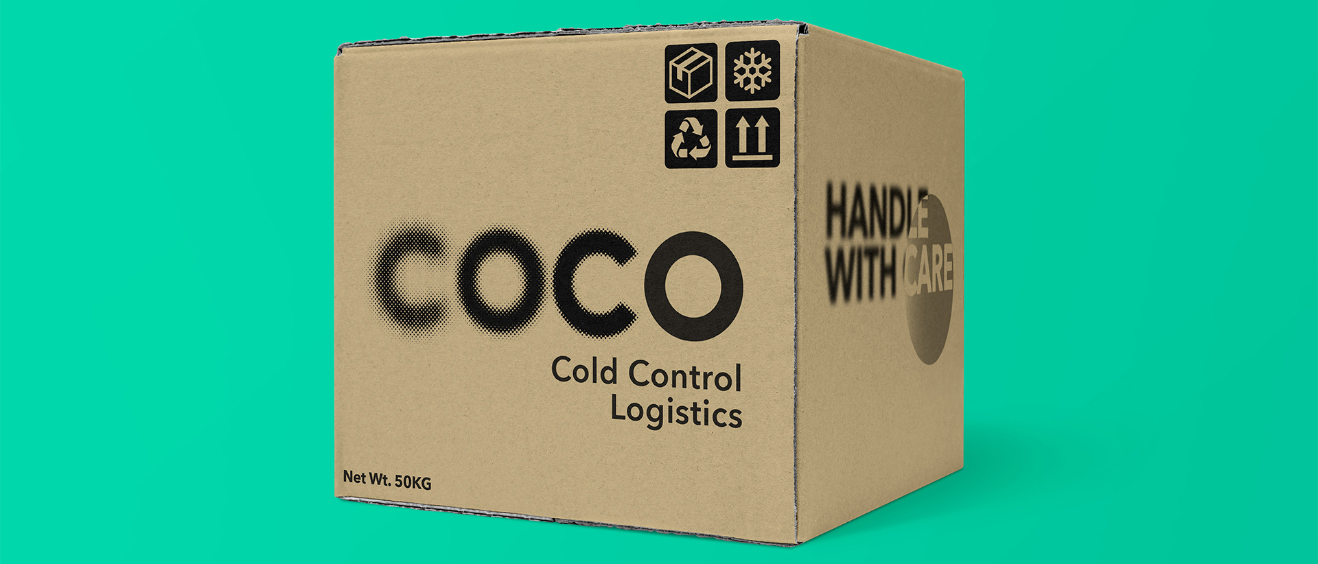
The Cold Control Logistics industry requires a deep understanding of the chemical and biological processes linked with perishables, and heavily relies on technology to ensure appropriate temperature conditions along the entire supply chain. Coco wanted to create a brand and identity that send a clear message to the market signalling their dedication to minimizing the hassle of cold logistics, focusing on the end result and shifting their behavior from what they do to why it matters.

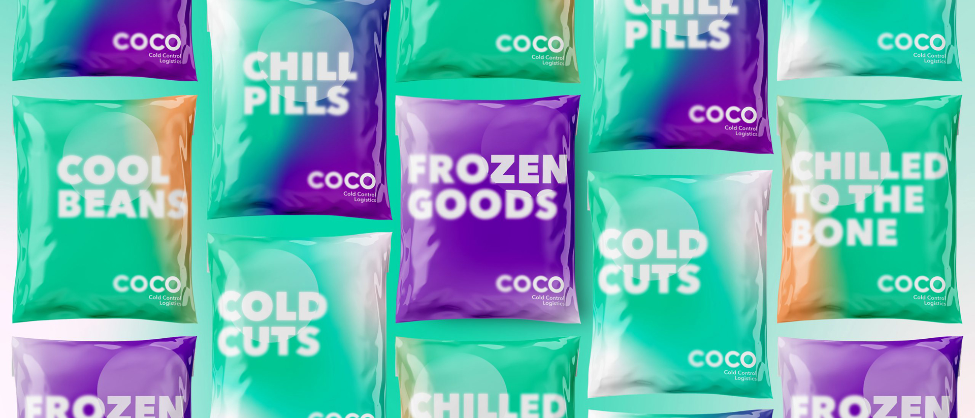
Our Strategy needed to find a creative territory that is ownable, easy to understand and relate to the industry, but also differentiated enough to stand out in a crowded marketplace. Our inspiration emanated from Coco’s brand purpose: “We exist to reduce the complexities of Cold Logistics so that you focus on what matters to you”

Asset-10@2x-100
The COCO name needed to vehicle the main attributes of the brand as human, agile, consistent and focused. It also needed to reflect a confident brand and a modern, friendly and positive tone of voice. While, as a brand, it was essential to be recognized as an intrinsic part of the industry, it was also important to signal the differentiated approach to how COCO looked at redefining a sector that is traditionally shy and introverted.
While most of the players focused on the tangible and functional aspects of their business, we chose to elevate COCO to the level of the emotional benefits, hence the simplified brand narrative: “COCO, The Logistics of What Matters to You.”

While the name still needed to vehicle the functional aspect of the business, it also needed to fulfil the brand’s purpose as an emotional brand. The result was in creating a name that embeds both sides of the story:

The functional side of the story: An embedded narration of the core raison d’être of the brand
COld and COntrolled Logistics

The emotional aspect: A witty twist that creates a memorable and highly recognizable name within the industry.

In its endeavor to promote its brand message and purpose, COCO needed compelling visual tools that support the claim throughout the entire fan of touchpoints while preserving consistency and constant market interest in the brand.
“The Logistics of What Matters to You” to a COCO customer, brought about the concept of FOCUS. What was needed is a compelling graphic representation of the concept, one that can be adapted to multiple situations, work under all circumstances and work across the entire brand’s ecosystem, hence the virtual LENS.
The LENS is the best-suited graphic device to narrate our concept of FOCUS. It is a graphic shape that can adapt to multiple visual interpretations, is aesthetically very attractive and adds value to the design. Most importantly, it perfectly translates the concept of FOCUS.

Differentiation

The Cold Control Logistics industry is all about ensuring perishable goods are maintained under the right temperature conditions throughout the entire supply chain. COCO wanted to use its verbal messaging in an innovative way to stress that point. The aim was to reassure customers that COCO cares about what really mattered to them; focusing on the end result rather than the mechanics.

There was a need to send clear messages about what COCO does, how it does it, but most importantly “why” it does it. The challenge resided in creating a verbal tone that is constantly interesting, engaging and never boring.

Based on the challenge of bridging between what COCO does and why it does it, the best course of action was to put the weight on typography, because of its versatility and power of adaptation. We also judged that a right mix between a typographic logo and the messaging typeface will create a strong symbiosis allowing each to support the other harmoniously.
The Cold Control Logistics industry is all about ensuring perishable goods are maintained under the right temperature conditions throughout the entire supply chain. The industry’s visibility is usually confined to a few elements such as the usual paperwork, occasional communication, and packaging. COCO needed to use its assets wisely, banking on the most visible ones and using them as a support for its brand messaging. Packaging was the most obvious answer.

With the lack of high visibility in the industry, and with a mostly B2B business model, we needed to find means to promote COCO’s brand positioning through all available touchpoints. It was found that the strongest touchpoint is the packaging, yet, there was not much leeway in altering the shapes. What was left is the design that comes with the existing packages.

Just like the name “Coco”, the new brand identity was unheard of in the industry. The new identity achieved the original stated intent, to create a brand that projects a “smart” yet “witty” identity, allows for scalability, and appeals to both businesses, and end-users exposed to it.

The result was an identity playful enough that it begs for constant exploration, yet serious enough to appeal to a professional audience seeking a trustworthy partner that allows them to focus on what matters to them.

If you are looking to maximize your brand value, or expand your work experience, get in touch with us.

GET IN TOUCH
for general inquiries, RFPs, and career opportunities

DUBAI

Dubai Design District
Office 209B, Building 6
P.O. Box 282379
Dubai ,UAE
+971 4 434 7152

RIYADH

Al Malqa
3141 Anas Ibn Malik Rd
Riyadh 13521
Kingdom of Saudi Arabia
+966 54 052 0263

©Brand Lounge 2024