ezgif.com-gif-maker

Salehiya

Practices

| | | |

Services

Brand Audit | Brand Guidelines | Brand Induction | Brand Intelligence | Brand Messaging | Brand Positioning | Brand Values | Culture-building Programs | Industry & Sector Analysis | Landscape & Competitive Assessment | Logo & Visual Language | Market Segmentation | Social & Content Strategy | Social Calendar Creation | Social Content Design | Thought Leadership & Triggers | UX/UI Design | Visual Identity Creation | Visual Rebranding | Web Design & Development

Industry

Healthcare

Brief

Salehiya, a leading healthcare distribution company in the Kingdom of Saudi Arabia, is a legacy business established in 1964 by Sheikh Mohammad Bin Saleh Bin Sultan who had the vision to improve the way healthcare was being delivered in the Kingdom. He set out to create a hospital catering to his own family needs. Today, Salehiya is no longer a hospital, but an ecosystem of healthcare distribution with logistical excellence. However, time came where a transformation was much needed.

Differentiation

After an in-depth and insightful regional market analysis, and competitor benchmark investigation, we uncovered the imminent need for an entire rebranding, a new purpose, and a digital shift in the brand’s communication.

As a legacy business, our main focus was to align Salehiya’s purpose with the core foundation of the company. Salehiya was much more than supply chain of healthcare distribution; it existed for a bigger reason, to better the entire community for generations to come. The purpose needed to echo this narrative throughout all aspects of branding.

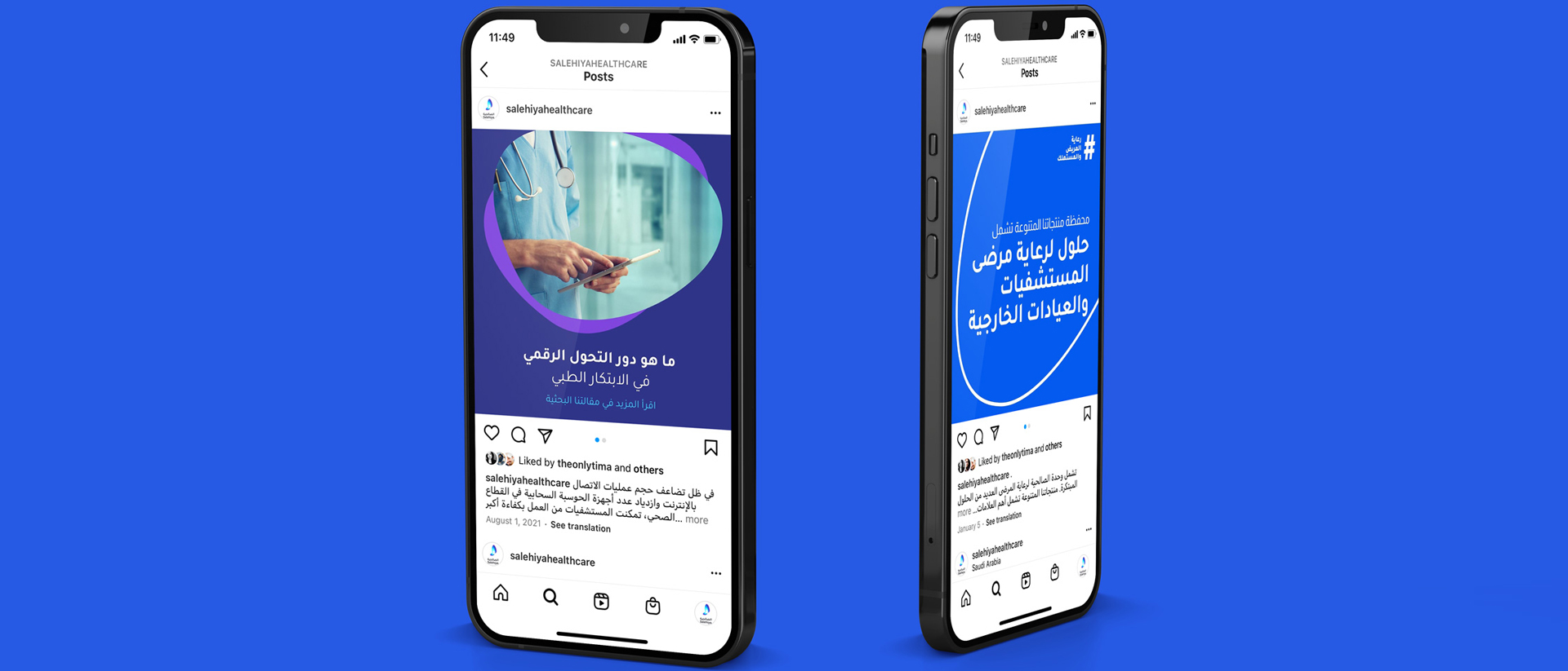
The target audience focused on 3 segments; Salehiya’s existing customers, potential customers, and the community of Saudi Arabia at large. In order to appeal to customers as well as consumers, we developed a brand that emphasized innovation in all its aspects – purposefully, visually, and communicatively.

The brand was outdated and left untouched for years, with no strategic marketing or communication done. When we dug deeper through the brand audit and stakeholder interviews, we understood that Salehiya is actually one of the biggest healthcare players in the Kingdom but few people knew about them as a result of the lack of communication.

We conducted research analysis and a brand voice audit to understand how Salehiya will need to communicate on a digital level. We also conducted a qualitative survey within the healthcare industry, targeting sectors such as government healthcare professionals, procurement entities, food and drugs authority, etc., in order to understand their needs and what they look for in a business partner.

We analyzed the data to isolate a market niche where we can establish a point of differentiation for Salehiya. Based on the brand’s long-standing history, we reached the concept of “Elevating the Healthcare Experience”, where Salehiya is portrayed as more than just suppliers and distributors, but an organization enabling the healthcare community in the Kingdom of Saudi Arabia.

The Latin word-mark is inspired from the Museo typeface, and has been slightly altered for geometric consistency. The Arabic word-mark is inspired from Tajawal typeface, also altered for geometric consistency
The colors of Salehiya are analogous to constant change with a palette of high-contrast hues.

SNOW and SLATE are the base colors used in the background of collaterals. They are also used as body text colors.

SKY and SAPPHIRE are used for headlines in some cases for emphasis, e.g., a quote on a social media post.

SPACE is used as an element color to add visual stylization to collaterals, e.g., as a shape or object.

SPIRIT is used in limited applications as a highlight and never in main context, e.g., as lines in an infographic.

The Salehiya Logo is a transitional metamorphosis. Inspired by light and butterflies, the logo was designed as a combination of dynamic layers that achieve the desired effect. 

The final shape, the Salehiya Wing, gives a feeling of motion and transformation, giving a sense of agility, dynamism and evolution.
03-6
02-5
04-2
05-2
01-4
The new Salehiya brand was rolled out in an internal launch to the entire team. With a new meaningful purpose, compelling visual identity, a pertinent brand space, and a clearly defined tone of voice and digital strategy, we created a differentiated and innovative brand that communicates and connects with its target audience, whilst maintaining its legacy.

Externally, Salehiya was launched through a digital campaign that communicated the moment of transformation under the idea of the butterfly effect. The campaign and the new brand were well received by industry leaders and peers.

If you are looking to maximize your brand value, or expand your work experience, get in touch with us.

GET IN TOUCH
for general inquiries, RFPs, and career opportunities

DUBAI

Dubai Design District
Office 209B, Building 6
P.O. Box 282379
Dubai ,UAE
+971 4 434 7152

RIYADH

Al Malqa
3141 Anas Ibn Malik Rd
Riyadh 13521
Kingdom of Saudi Arabia
+966 54 052 0263

©Brand Lounge 2024