
Karma Solar
Power to the One Billion
Karma Solar was founded with a singular ambition: to connect the world’s one billion people living without power to sustainable energy systems, and in doing so, expand access to healthcare, education, and food security.
Brand Lounge was appointed to build a brand identity capable of carrying that ambition, one that could speak credibly to investors and partners while remaining human enough to reach the communities it ultimately existed to serve.
Transform Awards 2023
SILVER | Best Visual Identity - Energy and Utilities
BRONZE | Best Naming Strategy
Solar energy brands have traditionally lived on the conservative end of the spectrum. Designed primarily for B2B environments, most communicate through the language of efficiency, output, and return on investment. Karma Solar’s mandate was fundamentally different.
Its products would move through B2B and B2G channels, reaching investors, governments, and procurement bodies. But the ultimate beneficiary was someone like a small farmer relying on a solar-powered irrigation pump.
The brand needed to be credible at boardroom level and human enough to mean something to the person at the end of the wire.
This dual audience created a real tension. The visual identity had to feel both high-tech and approachable, both industry-ready and empathetic. It needed to speak to energy poverty as a lived reality, not just a market opportunity, while competing in a sector where most brands look and feel the same.
Karma Solar also carried existing identity equity worth preserving. The challenge was evolution, not erasure.
Brand Lounge approached Karma Solar as a disruptive brand in a conservative category.
The intent was to position the company across the full spectrum of the industry, from institutional investors to the communities energy poverty had left behind, without losing coherence in either direction.
Rather than starting from scratch, Brand Lounge assessed the existing identity and identified what was worth keeping. The shape of the sun and the color palette carried genuine equity. Retaining them gave the new identity continuity while allowing everything else to be elevated and sharpened around a clearer vision.
The result was a brand built on two principles: innovation and empathy. Visually modern and technically credible for B2B and B2G audiences. Warm, simple, and purposeful enough to connect with the end-users whose lives the technology was designed to change. The minimalist approach became the organizing discipline, ensuring every element of the brand served the mission rather than decorated it.
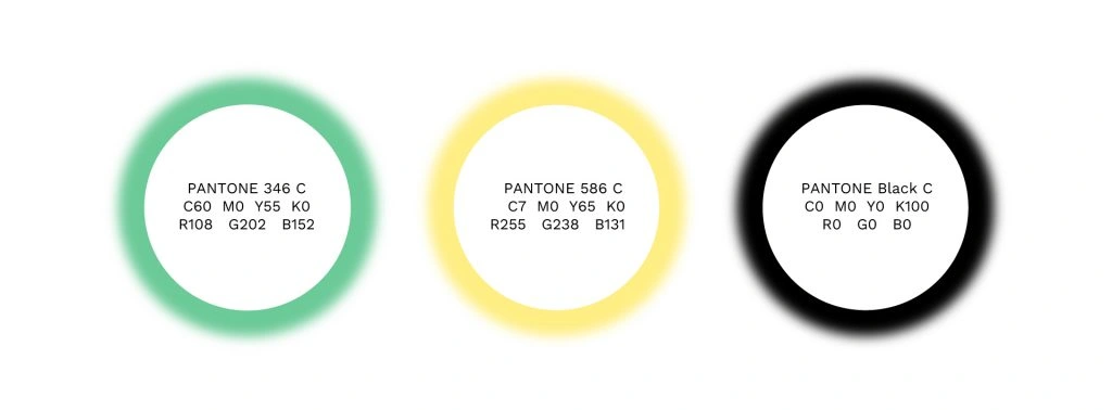
The refreshed logo retained Karma Solar’s sun motif and color palette while elevating both into a cleaner, more contemporary system. The evolution preserved brand recognition while signaling a new level of ambition.


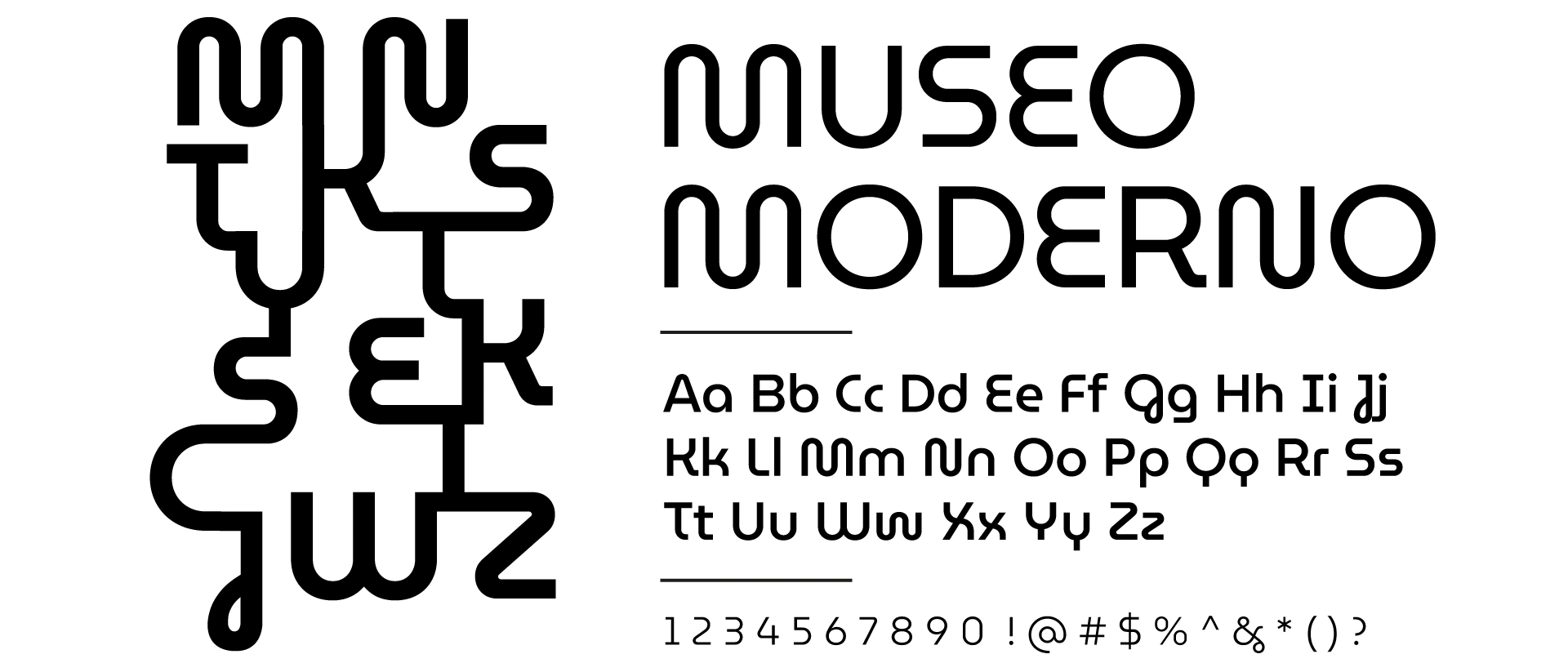
Typography was central to achieving the brand’s dual character. The chosen typeface carries a humanistic quality alongside a high-tech precision, its fluid letterforms bridging the worlds of technology and human connection. The “M” and “W” characters were selected in part for their resemblance to wires and power cables, a subtle visual metaphor for the flow of energy into the communities and livelihoods Karma Solar was built to reach.


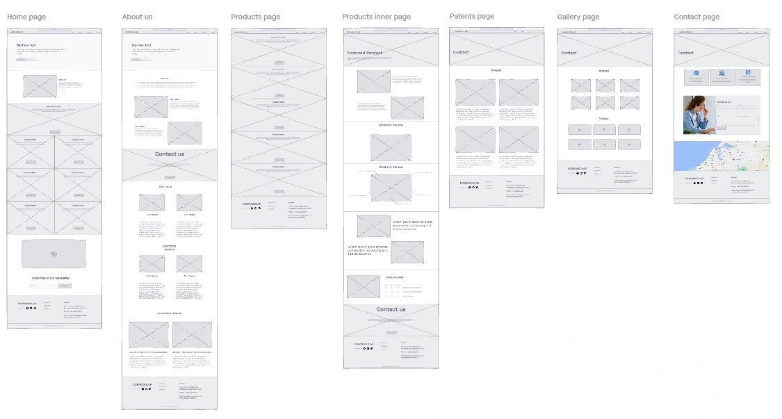
The website served as the brand’s primary business tool, designed with B2G audiences in mind. A minimalist structure gave prominence to Karma Solar’s backstory, mission, and product solutions, with animations on the solutions pages allowing visitors to understand each product’s components and function intuitively.
A product naming nomenclature was developed to communicate each solution’s purpose while maintaining emotional alignment with the brand’s philanthropic mission. Packaging was designed as the final expression of the brand promise, creating a moment of anticipation around each product and communicating clearly what it contained, how it worked, and what it stood for.


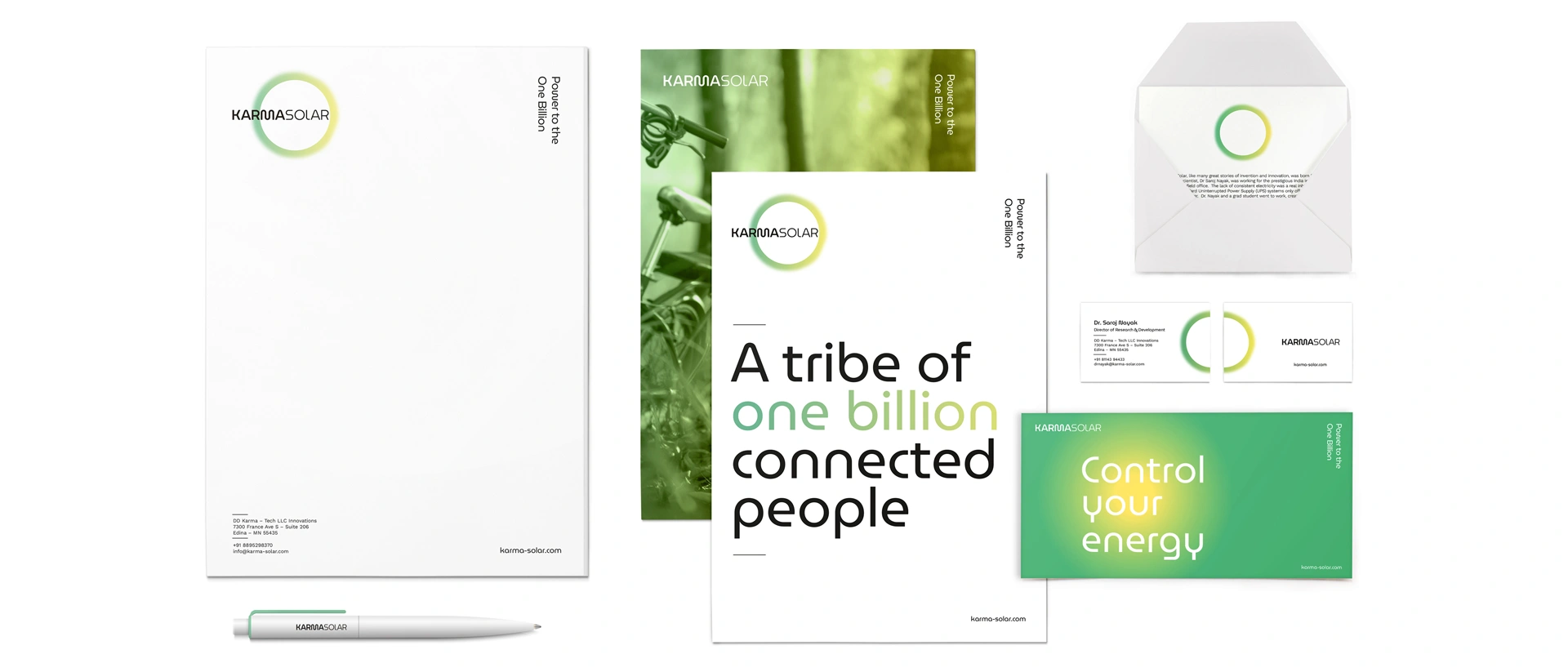
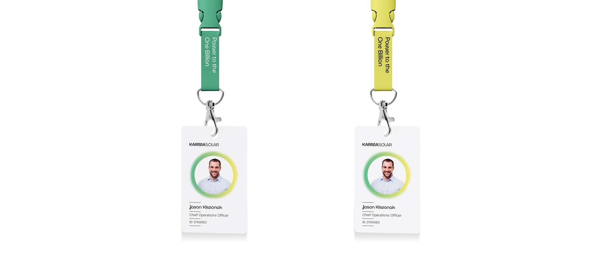


MAXIMIZED IMPACT
The new Karma Solar brand gave the company a platform it had not previously had: a visual language capable of holding both its commercial ambitions and its human mission with equal conviction.
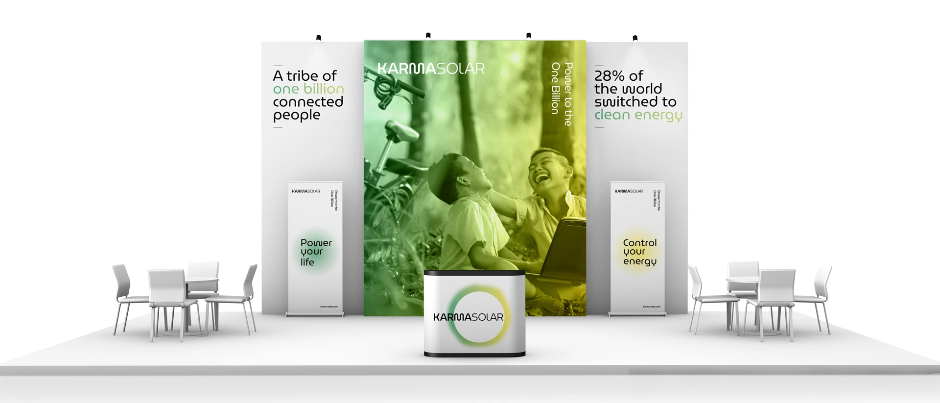
By moving away from the conventions of the solar category, the brand positioned Karma Solar as something the industry had not seen before: a company that spoke the language of innovation to investors and the language of care to communities. The minimalist approach proved its worth as a strategic discipline, making the brand equally at home in a boardroom presentation and on a product box delivered to a village without power.
.webp)


Our Practices
Through strategy, design, culture, and innovation, our practices are built to create brands with meaning.
We Build Brands That Matter
We are a global, independent, award-winning strategic brand consultancy helping organizations define meaning and unlock growth.
.webp)