.webp)
EIRA
Product Innovation
EIRA Water had built a strong reputation for purity within luxury B2B fine dining environments.
The next ambition was a significant one: expand into the mass FMCG market without diluting the premium positioning that defined the brand. In a category crowded with commodity products, EIRA needed to make the case for a new tier — one that sat between accessible mass-premium and untouchable luxury.
The Approach
Brand Lounge's approach to product innovation is rooted in the belief that packaging is not just a vessel — it is the brand's most immediate expression of its values. For EIRA, the opportunity was to translate the purity and provenance of Norwegian water into a design language that could hold its own in a retail environment without abandoning its fine-dining origins.
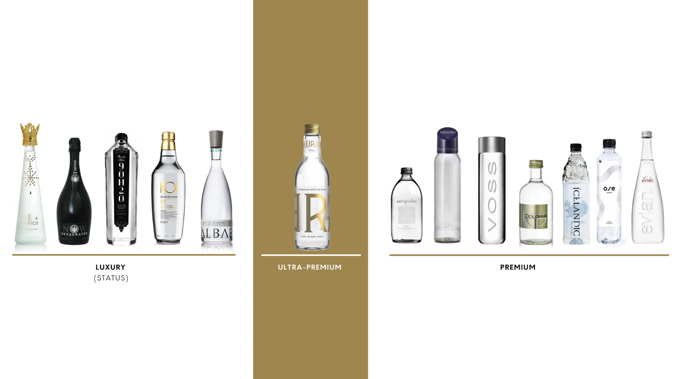
The strategy introduced a new category position — Ultra-Premium — and built the visual language of the new PET bottles around three design principles that kept EIRA's Norwegian heritage central to everything:
- Nordic Design — drawing from heritage and contemporary Scandinavian aesthetics to ground the identity in authentic origin.
- Norway as Context — ensuring the pristine Norwegian landscape remained the emotional backdrop to every product encounter.
- Bottle as Status Symbol — designing an iconic vessel that communicated quality before a consumer had read a single word.
The Solution: Product Innovation
The bottle concept was inspired by the brand's name itself — rooted in Eir, the Norse goddess of healing and purity. Drawing a direct line between Norse mythology and the product, Brand Lounge designed a bottle shaped after elixirs: a form that evokes luxury through silhouette alone and creates an immediate visual and emotional connection to the brand's Nordic origins.
An etched monogram on glass and a debossed version on PET caps added tactile quality at every price point. Even the cap was treated as a priority — designed with intent so that the consumer's physical interaction with the bottle reinforced the premium feeling from the very first touch.
.webp)
Critically, this was not a theoretical design exercise. Brand Lounge applied rigorous product design principles throughout — moving from hand sketching through 3D modeling to 3D printing, producing physical prototypes at every stage. Consumer testing validated both the functional performance and the sensory experience of the bottle, ensuring the final design worked as well in hand as it did on shelf.


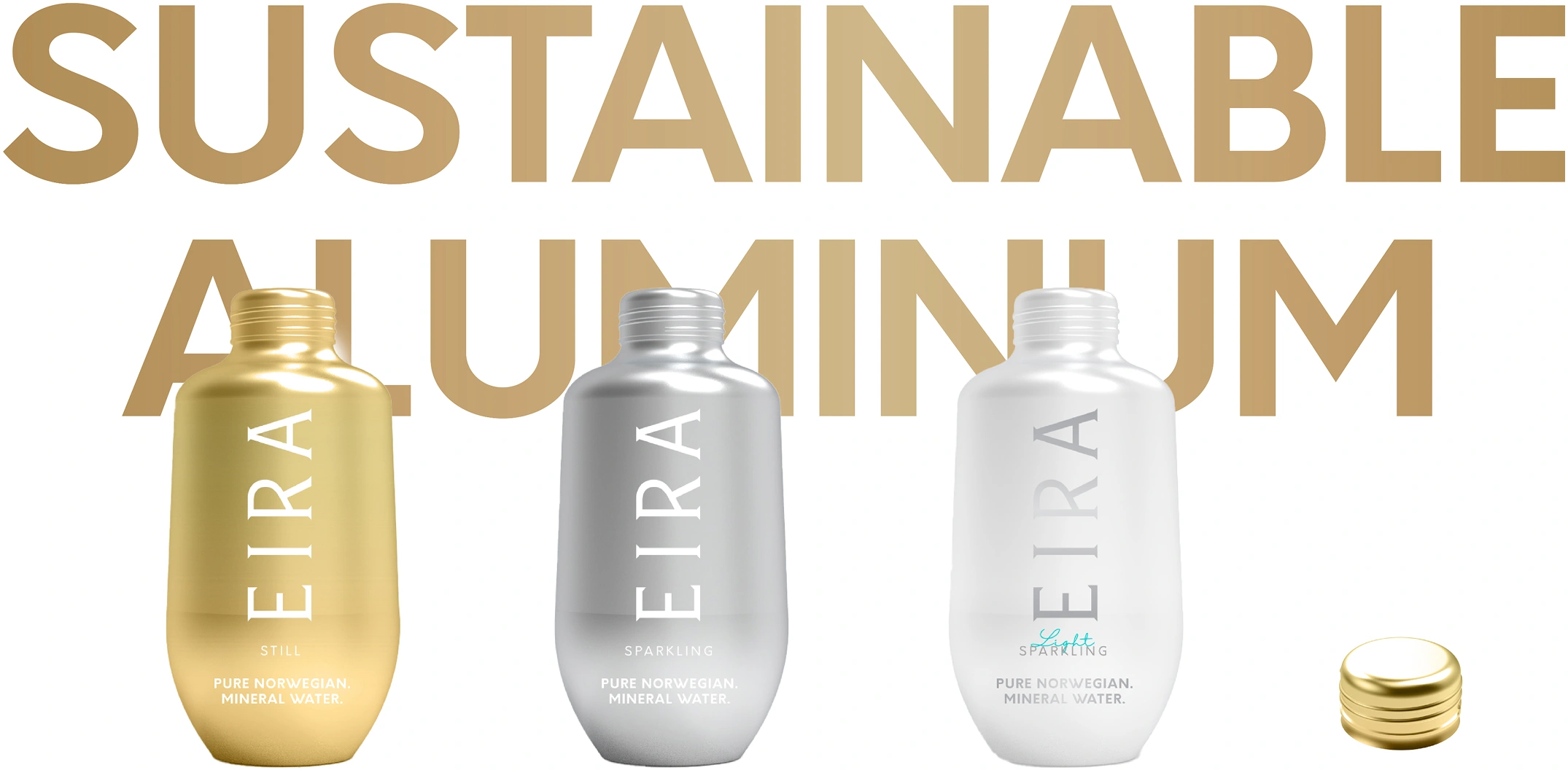
A 330ml aluminum bottle was developed as a sustainability extension, broadening the portfolio into environmentally conscious channels without disrupting the visual coherence of the range.
The Maximized Impact
The innovation delivered well beyond its primary objective of shelf differentiation, repositioning EIRA as a credible and coherent brand across both premium and mass channels.
- Bold retail shelf presence achieved through an elixir-inspired bottle shape and a distinctive visual identity that stood apart from category norms.
- A unified portfolio visual language across glass, PET, and aluminum formats, reinforcing EIRA's premium positioning at every price point.
- A new Ultra-Premium category position established, giving EIRA an ownable territory between accessible and aspirational luxury.
- Sustainability extended into the product range through the aluminum bottle, reflecting EIRA's commitment to responsible innovation.
.webp)

Our Practices
Through strategy, design, culture, and innovation, our practices are built to create brands with meaning.
We Build Brands That Matter
We are a global, independent, award-winning strategic brand consultancy helping organizations define meaning and unlock growth.
.webp)